

Discovery and user testing
I combine thoughtful product discovery with practical, insight-driven user testing to uncover real user needs and translate them into clear, confident design decisions.
I often start with the question, “What don’t we know yet?” I use AI to help frame every step of discovery and user testing, from competitive analysis to analyzing qualitative responses to outlining the share out for stakeholders.
The discovery phase involves:
partnering closely with product managers and business stakeholders to align on goals and surface unknowns
leading competitive and comparative analyses across both media and non-media landscapes to understand patterns, opportunities, and emerging expectations
conducting surveys to capture users’ needs and motivations
Using these inputs, I synthesize themes and identify research threads worth exploring. I present findings in a way that helps teams make informed decisions and shape product direction with clarity and evidence.
I test early and often. This includes:
language
visual design
flows and navigation
overall usability
Each round is structured to highlight where the product meets user expectations—and where it doesn’t. The results help stakeholders see the product through users’ eyes, validating strong directions or revealing opportunities for improvement before we invest further.
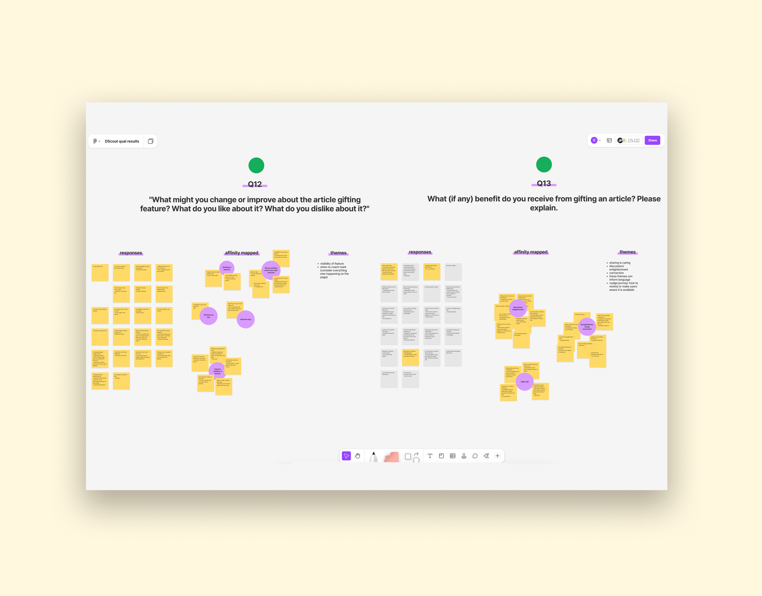
As part of my product discovery work, I led an initiative exploring a potential gift-an-article feature for subscribers. The goal was to understand how this benefit could strengthen subscriber value, drive engagement, and attract new readers through organic sharing. I began with a broad competitive analysis—both within and outside the media industry—to identify how other companies position sharing features, what motivates users to share content, and what language or UI patterns create clarity and trust.
To ground our insights in real user behavior, I designed a Dscout Express research mission focused on understanding whether consumers use gift-article features today and, importantly, why or why not. We explored what prompts people to share, which channels they choose, how publishers communicate this benefit, and whether sharers receive feedback about how their gift was used. We also examined the experience from the recipient’s perspective to uncover what encourages continued engagement or trial.
Recommendations included:
the importance of awareness and ongoing reminders
thoughtful placement in onboarding and nudge journeys
clear UI indicators directly on articles—such as counters showing remaining gifts and prominent prompts on exclusive content
messaging for both the gifter (“discuss, inform, share”) and the recipient (“enjoy more articles like this with a one-week trial”) emerged as key levers
our competitive analysis also surfaced the value of an educational page that clearly explains how gifting works, setting expectations, and reducing friction across the experience
User testing is an integral part of our workflow. We use it to validate design direction and pair it with analytics to drive design decisions.
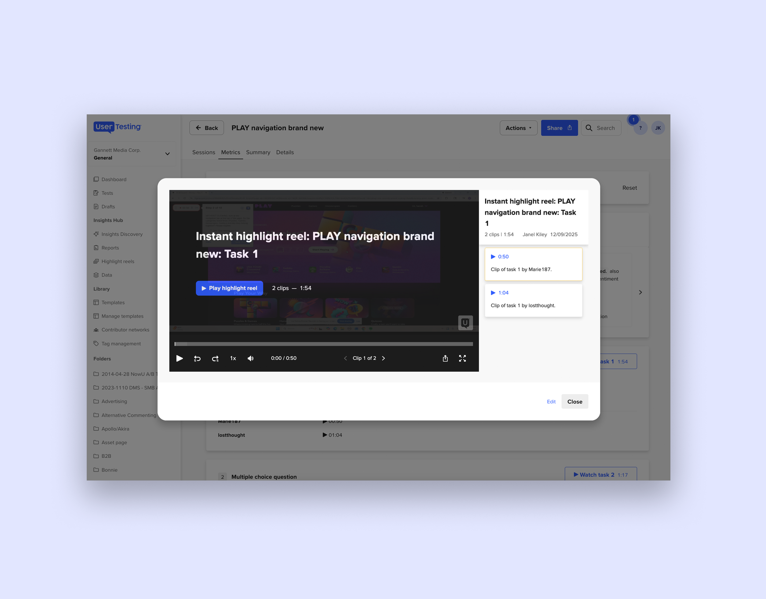
Recently I tested proposed revisions to the navigation of our PLAY hub. The study compared the current site layout with a new design, focusing on how users discover and access crosswords, puzzles, and other games. We screened for frequent desktop users, as we know that more than 70% of users are on desktop.
We explored first-click behavior, navigation clarity, and the perceived logic of grouping features like comics, horoscopes, and quizzes.
The results were clear: 80% of participants preferred the proposed design, citing its simplicity, improved organization, and quicker access to popular puzzles. Users responded positively to the streamlined navigation bar and the addition of a featured games section, which made it easier to find both familiar and new content.
Feedback also revealed mixed feelings about including horoscopes and comics in the main navigation, with several users suggesting these items felt out of place compared to core puzzle offerings.
Based on these insights, I recommended moving forward with a “chip” navigation approach—highlighting three default games (Crossword, Quick Cross, Sudoku) and a rotating featured game, with future plans to personalize these options based on user activity.